 Shell.
Think what you like about them as a company, but they have a vivid and
instantly recognizable branding. Their logo is something that many other
designers seem to wonder at, because it has managed to lodge in people’s brains
so brilliantly.
Shell.
Think what you like about them as a company, but they have a vivid and
instantly recognizable branding. Their logo is something that many other
designers seem to wonder at, because it has managed to lodge in people’s brains
so brilliantly.
But how did it get to its clean,
modern look today? That is an interesting story…
Though Shell is today known as an
oil and gas company, it was originally – back in the 1891 – a trading company
that specialised in bringing old oriental sea shells to western nations. Nine
years later Marcus Samuel, founder of the company, decided he need a logo.
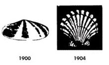 Like
many first drafts, the 1900 logo was fairly poor. It was a dull, poor quality
black and white version of a mussel shell. Of course, the mussel shell is not
an attractive shape, and the angle at which it was pictures as not tremendous.
Three-dimensional logos – as even designers today acknowledge – are a hit and
miss idea which takes exceptional skill to pull off. So in 1904 the mussel
shell at a 60 degree angle gave way to a more aesthetically pleasing scallop
shell, shot from above. Still, however, the limited color palette and the harsh
black background made it seem poor.
Like
many first drafts, the 1900 logo was fairly poor. It was a dull, poor quality
black and white version of a mussel shell. Of course, the mussel shell is not
an attractive shape, and the angle at which it was pictures as not tremendous.
Three-dimensional logos – as even designers today acknowledge – are a hit and
miss idea which takes exceptional skill to pull off. So in 1904 the mussel
shell at a 60 degree angle gave way to a more aesthetically pleasing scallop
shell, shot from above. Still, however, the limited color palette and the harsh
black background made it seem poor.
The first two versions of this logo
were essentially pictures which were desaturated and increased in contrast to
give something approximating a logo. They were not hand drawn, per se. However,
the 1909 logo was better.
Here was something new: it was
distinctive and clear (if still a little too natural looking: the crimping at
the top of the shell may be true to life but it does not make for a brilliant
logo). This design lasted more than two decades.
1930 was the next redesign, with an
art deco style shell which is brilliantly symmetrical and much cleaner to the
eye. It almost looks like a crown – something the company were keen to
emphasize.
1948 saw the first dash of color –
but in design terms it was a step backwards. Rather than the clean lines of the
1930 design, Shell took the blurry realism of its 1909 logo, and slightly
modified it to make it taller and prouder, hand-coloring it.

Red and yellow were chosen as the
primary colors because Shell’s home was initially in California, and the
company were keen to stress their links with Spain to the Hispanic population.
1955 was a much cleaner iteration of the logo, with the ‘Shell’ text matching
the rest of the color scheme. By 1961 a red background had been added, which
took away from the starkness of the logo.
1971 was a wholesale redesign,
cutting out the clutter. The man to thank for that is Raymond Loewy. Since then
there has been minor tinkering – mostly with levels and richness and depth of
color, but also with the addition of text – but Loewy’s logo is largely the same
in 2011 as it was in 1971.
The dream of designing a logo which
lasts for 40 years is something we can all aspire to. The lesson in the
longevity of the 1971 version is clear: crisp, minimalist design will always be
popular.
Tidak ada komentar:
Posting Komentar